“The secret to beauty”, builds on our promise to create a secret sanctuary for clients and guests to feel their best. This creative comes to life in our tone of voice, and also our approach to a quiet but confident visual identity.
The rounded shape in the Y and A lettering resembles a keyhole, emphasising the idea of peering inside to a secret place. The L's are strong, supportive letters that ground the Y and the A.
A monogram has been created as an extension of the brandmark. It is to be used in various applications where the brandmark does not exist.
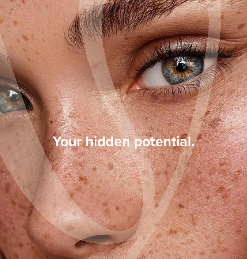
A macro crop of the letter forms becomes an ownable brand asset to be used occassionally as a veil across socials, or across printed collateral.
Lyla’s colours are a palette of rich and soft earthy tones and have been selected to represent the brand’s premium and luxury aesthetic while still remaining warm, grounded and welcoming.
Art direction and design of branding for Willow & Blake.